Summary
By creating a visualization of your workflows you can find optimizations, make process improvements, and highlight the stages of your customer's experience. In this post I will explain a few methods on how to visualize both the work of your CX team and the customer journey as part of creating your overall Playbooks.
Process Visualization
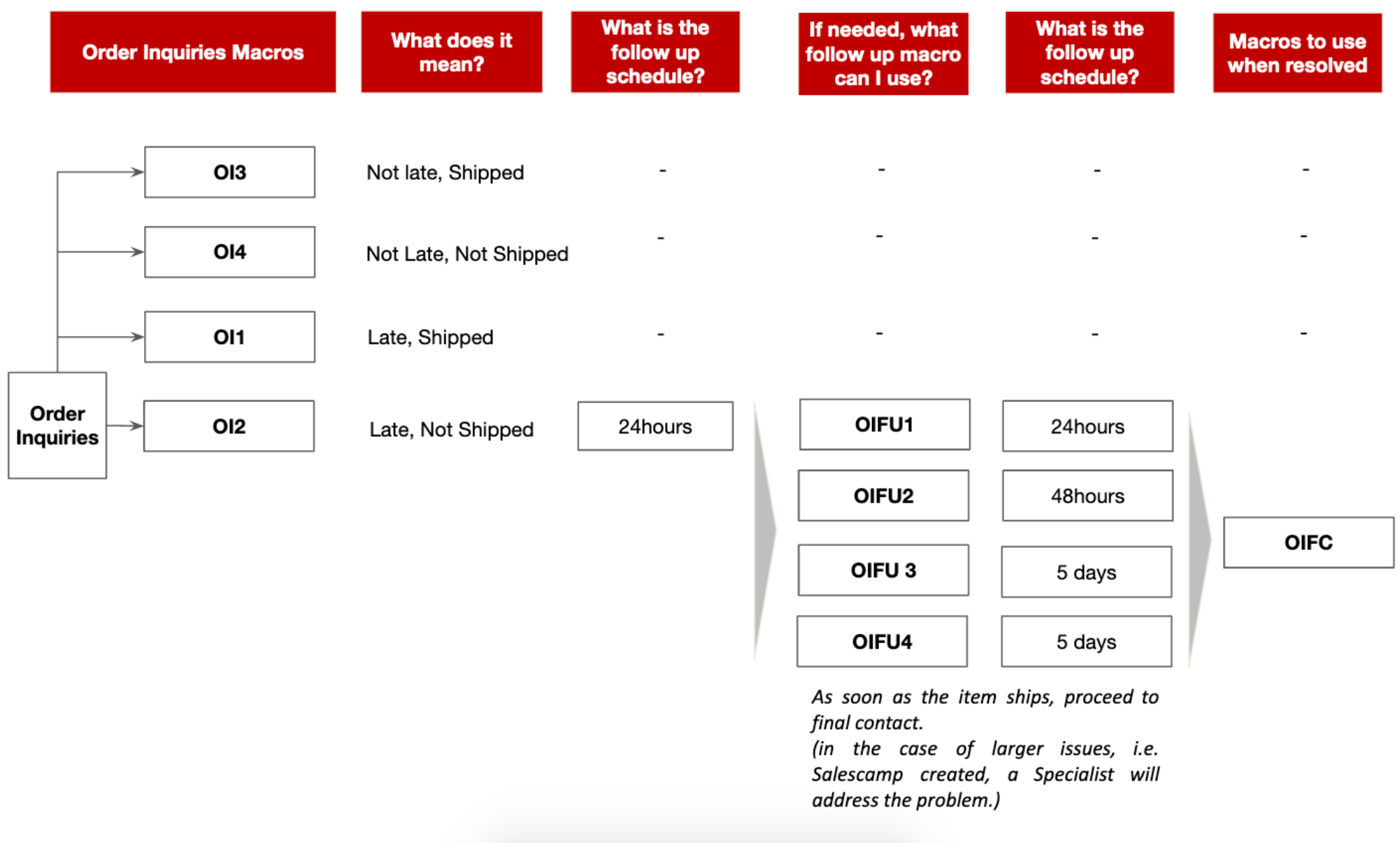
Since a picture is worth a thousand words, here's a visualization of our Order Inquiry workflow for an e-commerce company:
 In this case, the visualization is more high level as a general overview of how the CX team would interact with a customer. It does not tell you exactly what to do, or how to do it. It does give you an idea of what will happen when a customer files an order inquiry.
Stepy-By-Step Visualizations
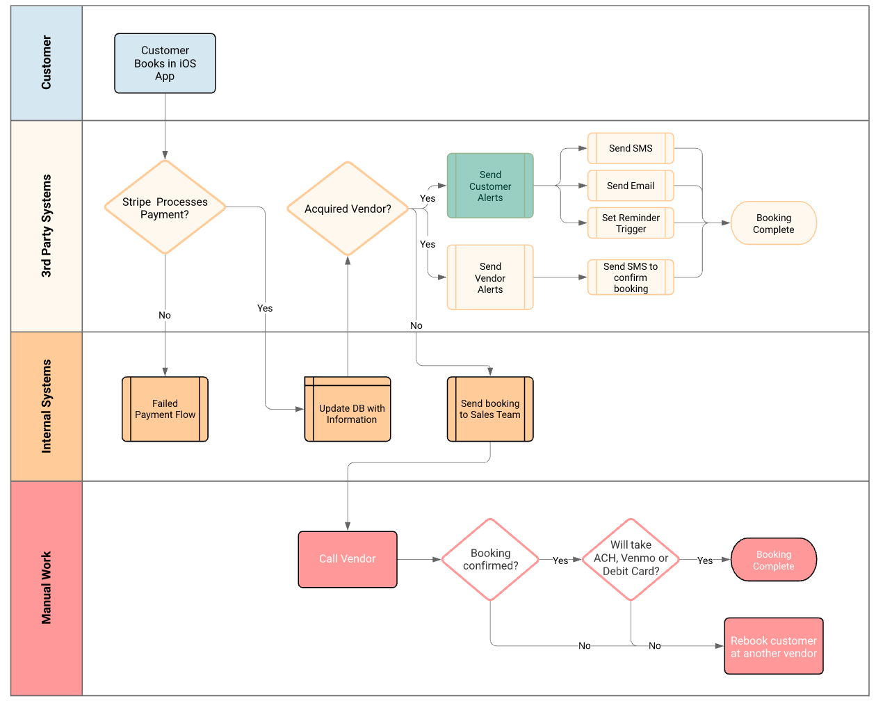
Another form of a visualization can be very detailed with step-by-step instructions for each action. It will typically show both the internal and customer processes to solve the problem. Workflows like this tend to be much more cross-functional, exposing more of the business operations. This is where it becomes fun, because it's really about the Customer's Experience with your product, and not just about how the CX team responds.

The details in this type of diagram can become overwhelming, and it's a best practice to link to other diagrams that show you how to process other steps.
If you're looking for a great SaaS tool to help you build diagrams, I would recommend Lucid Chart, it's the best tool that I know of for a few reasons:
- It has multiple process diagram templates
- It educates you on process map principles
- Their customer success team is very helpful
- You can easily share diagrams across your company and embed them in your Playbooks!
How to Start
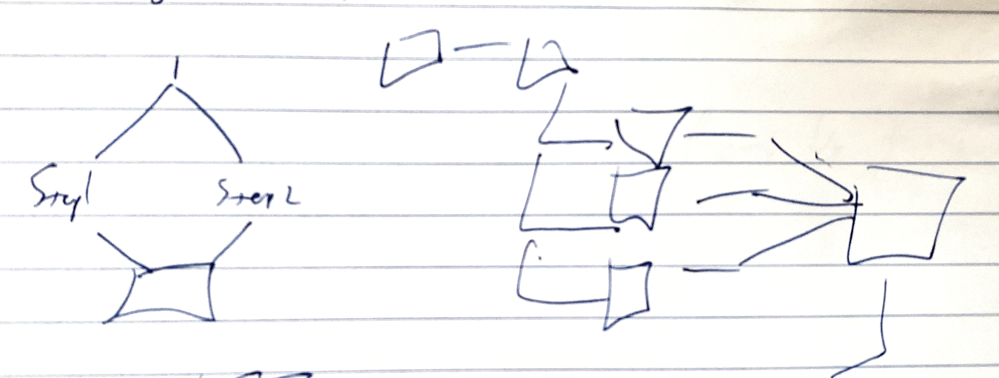
For sure, it's intimidating to look at completed diagrams and wonder how you'll ever get there. I would always recommend starting with pen(cil) and paper. Experiement a bit writing out the steps, the decision points, and outcomes that you want. Ultimately, if you can fit it on 1 page then you can put it on a training slide, and team other people about it. It's also a good exercise to check if your process or communiation (or both) is overcomplicated.

Here's an actual example of how I started the more detailed workflow that you see above. Good ol’ pen and paper does the trick for me to experiment and put my ideas down. From there, it's a lot of iteration, practice with the tooling, and cross-functional work.
TLDR for Executives
Data Visualization…
- Will tell you what happens inside of other departments, not just CX
- Are cross-functional
- It's important that you can see what happens with your customers
TLDR for Operators
Data Visualization…
- If you can vidualize it, it's real and if it's real you can change it.
- Write down what your team does
- Highlight where and how your team needs help, so don't be afraid to ask for it
- When you ask for help, be action-oriented!